Visualizations with Matplotlib
A picture is worth a thousand words
What is Visualization?
A human mind can easily read and understand a chart or image as compared to looking through a large chunk of data in a table or a spreadsheet. Data visualization is a powerful technique to visualize and get meaningful insights from the dataset.
Matplotlib
Matplotlib provides a way to easily generate a wide variety of plots and charts in a few lines of Python code. It is an open source project that can be integrated into Python scripts, jupyter notebooks, web application servers, and multiple GUI toolkits.
Installing Matplotlib
The best way to install matplotlib is by downloading the Anaconda distribution. Anaconda is a set of python libraries which has the standard python programming language libraries as well as numerous third party scipy libraries like numpy, pandas, matplotlib etc.
Or you can install matplotlib by using pip
pip install matplotlibPlotting a simple graph.
Let’s start by plotting a simple graph.
import numpy as np
import matplotlib.pyplot as plt
%matplotlib inline  # Add this line if you are using Jupyter notebook.
x = np.linspace(0,5,11)
y = x**2plt.plot(x,y)
plt.xlabel('X Axis')
plt.ylabel('Y Axis')
plt.title('Sample plot')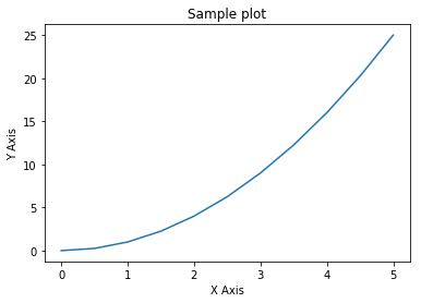
Adding a legend
A proper figure is not complete without its own legend. Matplotlib provides a way to generate a legend with the minimal amount of effort.
fig = plt.figure()
axes = fig.add_axes([0,0,1,1])
axes.plot(x, x**2, label='X Squared')
axes.plot(x,x**3, label = 'X Cubed')
axes.legend()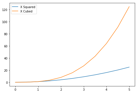
Creating a Subplot
Sometimes it is helpful to compare different views of data side by side. To help with this, Matplotlib has the concept of Subplots: groups of smaller axes that can exist together within a single figure.
fig, axes = plt.subplots(nrows=1, ncols=2)
axes[0].plot(x,y)
axes[1].plot(y,x)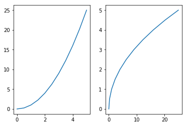
Customizing Plot Appearance
import numpy as np
import matplotlib.pyplot as plt
%matplotlib inline
x = np.linspace(0,5,11)
y = x**2plt.plot(x,y, color = 'red') # add color to the plot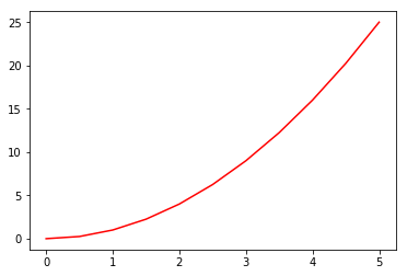
# add line style and line width to the plot
plt.plot(x,y,color ='purple', linewidth = 3, linestyle = '--') 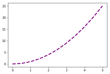
# add marker for the points on the plot.
plt.plot(x,y,color ='purple', linewidth = 3, linestyle = '--', marker = 'o') 
Scatter Plot
Scatter plots are used to plot data points on a horizontal and a vertical axis in the attempt to show how much one variable is affected by another. Each row in the data table is represented by a marker whose position depends on its values in the columns set on the X and Y axes.
x = np.random.rand(1, 50)
y = np.random.rand(1, 50)
plt.scatter(x, y, color='red')
plt.xlabel('X axis')
plt.ylabel('Y axis')
plt.title('Scatter plot')
plt.show()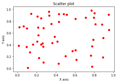
Histogram
Histograms are useful for plotting the distribution of numbers across a range of possible values. It works by taking a list of numbers, binning those numbers within a number of ranges, and counting the number of occurrences in each bin.
x = np.random.randn(1000)
plt.hist(x, bins=30)
plt.ylabel('Frequency')
plt.title('Histogram')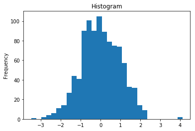
Bar Chart
Bar charts are used to display values associated with categorical data.
x = ['Java', 'Python', 'PHP', 'Javascript', 'C#', 'C']
share = [21.5, 19.3, 8.3, 7.9, 7.6, 6.3]

x_pos = [i for i, _ in enumerate(x)]

plt.bar(x_pos, share, color='green')
plt.xlabel("Programming Languages")
plt.ylabel("Share(%)")
plt.title("Programming Language Index")

plt.xticks(x_pos, x)

plt.show()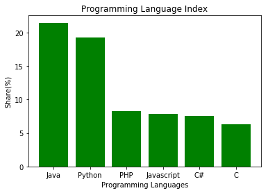
Check out the matplotlib documentation to deep dive into this.
Also cheat sheet can be found here.
